An analysis of 5 shoebox units floor plans from an architecture student

PHOTO: Stackedhomes
For many young singles in Singapore, purchasing and owning a property might be the biggest hurdle to overcome in their late twenties or early thirties.
Looking around me, the conversations have indeed shifted.
Although most of my peers are in their early twenties, many of them are already speaking of purchasing their own homes, or at least wanting their own space in the near future.
Considering rising property prices, it’s a common train of thought: will I ever own a home of my own?
Clearly an exaggeration, but there is an element of truth here still
As much as we’d like to plunge for the more affordable option in an HDB, not everyone can afford to wait till 35 to buy a HDB flat .
This is where shoebox units enter the picture. Unlike most homes, shoebox units are residential homes that are 500 sq ft or smaller.
While some may be more expensive given their strategic locations, the small sizes represent one of the lowest entry points for any aspiring homeowner – hence the natural inclination for young singles.
But of course, it has its imitations.
A shoebox unit is ultimately, small.
So for the living experience to be pleasant, a lot of consideration needs to be put into the pre-purchasing stage – even more so than larger homes.
Note: small may not necessarily mean bad, it just means that you will need to be smart about maximising the space available.
As the saying goes:
“Small is about condensing the way you live, overlapping function and using all dimensions of a space.”
With a greater need to ensure that spaces within the unit are maximised, the layout has to be efficient and logical in respect to you and your lifestyle.
As an architecture student, my goal in this article is to provide perspective by taking a closer look at 5 different shoebox units and their floor plans. These units will then be ranked, so as to give you a better idea of the plus points and pitfalls.
Do note that the ranking is based purely on the floor plans, I’m not taking into account any location benefit or price at all.
Let’s get right to it.

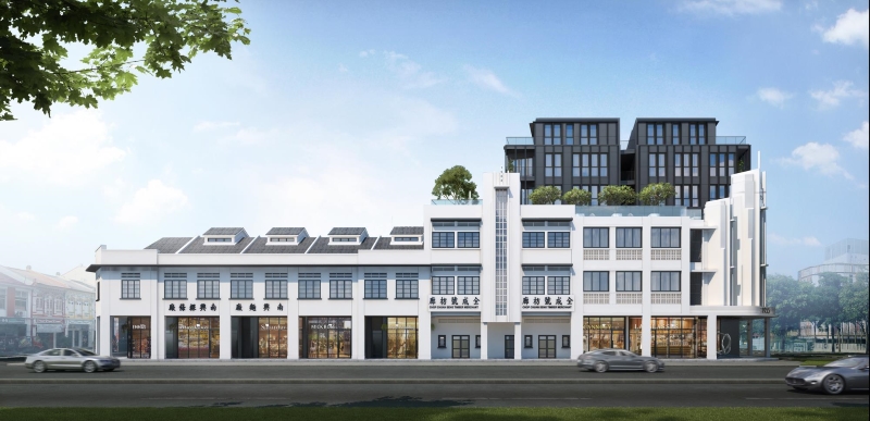
| Project: | One Pearl Bank |
|---|---|
| District: | 03 |
| Address: | 1 Pearl Bank |
| Tenure: | 99 years |
| No. of Units: | 774 |
| Site Area: | 82,376 sqft |
| Developer: | CapitaLand |
| TOP: | 2023 |

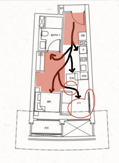
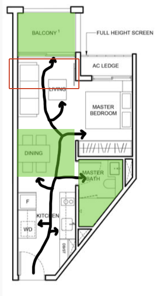
As far as shoebox units go, you’d usually find little innovation here – most layouts are simply rectangular.
Which is exactly what makes this One Pearl Bank unit so refreshing, given its fanned-out layout. At the end of the unit, it is actually slightly wider than the entranceway, giving you the impression of a more spacious unit than it is on paper.
However, it’s important to see if the unit is actually spacious. Moreover, in the context of a shoebox unit, spaciousness may not be favourable as it suggests an underutilisation of precious space.
So despite the seemingly breath of fresh air layout, it actually places living constraints, as I’ll explain further below.
Once you enter the unit, there is a rather big circulation space of ~54 sq ft that cannot be used.
Between the bed, washroom and kitchen, there is also a substantial amount of space with no clear programme assigned to it.
While this openness may be appreciated by a bigger household, it seems excessive here as most people living alone (or even with a spouse) simply do need that much space to manoeuvre about the home.
This spaciousness here is directly contrasted with bottleneck issues in another part of the unit.
Now, for you to access the living room, you will almost have to squeeze in between the sofa and dining area, and this is directly caused by the orientation of the walls.
As the walls are not straight, the kitchen appliances and the dining table will also have to be placed in a slanted fashion so as not to have awkward gaps.
But here’s the bigger problem.
This will cause certain circulation paths, such as the path to the living room to be cramped. When circulation problems like this surface, the aforementioned spaciousness may then indicate poor planning, as the amount of space can be more efficiently distributed.
Now let’s take a closer look at the living room, where it is quite clear that the same issues persist.
Like the kitchen appliances, the television is orientated at a slight angle. So for the occupant to have a pleasant viewing experience, either the television or the sofa will need to be tilted so they can be parallel.
However, given the already tight space in the living room, huge adjustments cannot be made as well.
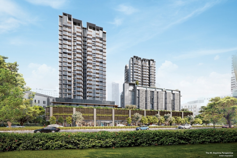
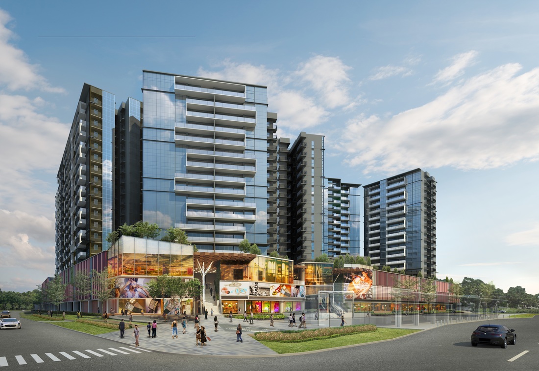
| Project: | The M |
|---|---|
| District: | 07 |
| Address: | Middle Road |
| Tenure: | 99 years |
| No. of Units: | 522 |
| Site Area: | 80,327 sqft |
| Developer: | Wingcharm Investment Pte. Ltd. |
| TOP: | 2024 |
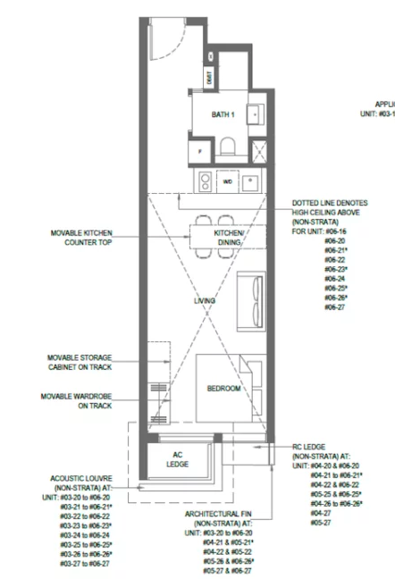
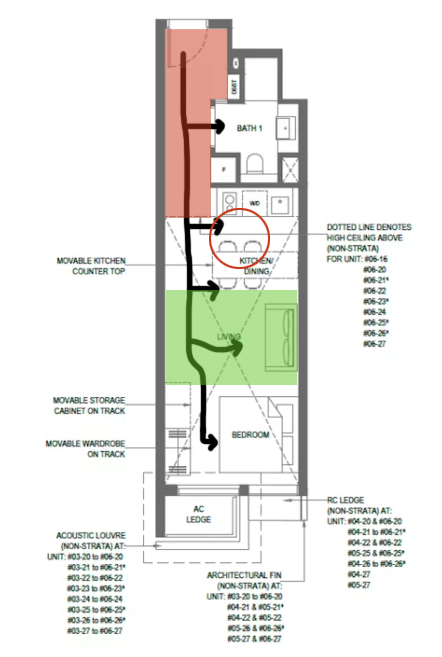
For this The M shoebox unit, while there are no glaring problems visible from the floor plan, there are still some inefficiencies present.
Given the amount of usable space in a shoebox unit is limited, it’s crucial that there are no redundancies in terms of spatial arrangement. In this unit, however, there is a hallway of ~53 sq ft that leads the occupant to the rest of the house.
So as this hallway is rather narrow, it is difficult to add some furniture to this space to make it usable, as it might restrict circulation. This space in turns becomes somewhat of a lost opportunity.
But let’s look at the positives here. What I especially like about this unit is the flexibility that you get with the movable kitchen countertop.
What this essentially means is that you can cater to almost all kinds of scenarios. Having a small gathering? Move the countertop over the kitchen stove to allow for a bigger living area.
Takeaway night? Move the countertop back for a quick and casual dining space.
While this requires some time to set up, it definitely appeals to have a multi-functional space here.
But really, the best part for me is the size of the living room. While it is short, it is very wide, and has an area of ~86 sq ft. If you’re wondering why this unit seems to have extra space it really is because of the lack of a balcony. For sure, this can be a boon or a bane, depending on your lifestyle preferences.
| Project: | 1953 @ Tessensohn |
|---|---|
| District: | 08 |
| Address: | 1 Tessensohn Road |
| Tenure: | Freehold |
| No. of Units: | 72 |
| Site Area: | 17,938 sqft |
| Developer: | Oxley Amethyst Pte Ltd |
| TOP: | 2023 |

While there are still slight circulation and spatial concerns with this unit, I think the spaces here appear to be quite well-planned.
Generally, you can see that the different spaces do not conflict with one another when being used. An example would be how the dining space does not block circulation even when it is fully occupied. This is only possible because there are actually mini buffer zones between each of the main spaces.
Personally, the washroom and balcony in this unit also appealed to me.
I enjoy how the washroom is near the master bedroom, allowing for easy access. At the same time, the washroom is in a rather central location within the unit, allowing for easier access regardless where the occupant is at any point in time.
Not many people will like the inclusion of a balcony here, but personally, I do like the option of an open space – which will definitely be cathartic in this shoebox unit.
So even if you do not go out onto the balcony, the sliding doors leading to the balcony could be left open for some ventilation and natural light. In some sense, the unit will not feel as stale and restrictive.
With all that said, let’s now look at the downsides of the unit.
In this unit, the kitchen appliances are not just installed along one wall, but two. As such, the occupant will need to cut through the kitchen directly to access the rest of the house.
While this is completely fine if there is only one occupant, the circulation here can be slightly tight if you are living with someone else, or if you do have guests over.
Circulation issues aside, a bigger problem can be found in the living room.
Given the orientation of the living room, the television is installed on a very narrow, L-shaped wall, where it is protruding out ever so slightly (of course, unless you are content with a smaller television).
I don’t know about you, but when the television is not centred it generally irks me – but this is really based on personal preferences.
Personally, if I were to stay in this unit alone, I will swap the sofa out for a chaise lounge to free up additional space for storage furniture. This will in turn increase the efficiency of the layout.
| Project: | The Poiz Residences |
|---|---|
| District: | 13 |
| Address: | Meyappa Chettiar Road |
| Tenure: | 99 years |
| No. of Units: | 732 |
| Site Area: | 173,830 sqft |
| Developer: | MCC Land |
| TOP: | 2019 |


Overall, the unit of this layout is largely efficient. At first glance, there is no wasted space, and every part of the house serves a function.
I would say that this unit seems to cover all bases. Like the 1953 unit, this unit contains a balcony. Although the balcony is smaller here, it still provides the same flexibility for outdoor leisure activities and ventilation.
Moreover, this unit is the only one in this list that has a dedicated study area. Other than providing the occupant with a comfortable space to work, this area is segregated by the kitchen from the rest of the main spaces in the house.
As an individual who works mostly from home, this may be my favourite part of the home as some degree of work-life balance can be instilled in my home. I do also like that the kitchen and washroom are located in close proximity, so I can take a quick snack or a toilet break without being distracted.
Moving to the innermost part of the home, it is clear that some thought has been put into designing the living room and bedroom.
Although both the living room (~73 sq ft) and bedroom (~83 sq ft) are both on the smaller side, the arrangement of spaces do make sense. Unlike some units where the width of the living room and placement of television are awkward, the living room here looks comfortable.
Once again, it is not to say that this unit does not have any flaws.
Although shoebox units are mainly for individuals who live alone, it will be better if the spaces are not programmed to be isolating in nature. Here, the dining table is aligned against the wall to prevent circulation from being cut off.
This type of counter style dining is akin to a fast food restaurant – where the mentality is more of and eat and go type situation, rather than a sit down, social dinner. It’s fine if you are living alone, but with two people I would say that it isn’t quite ideal.
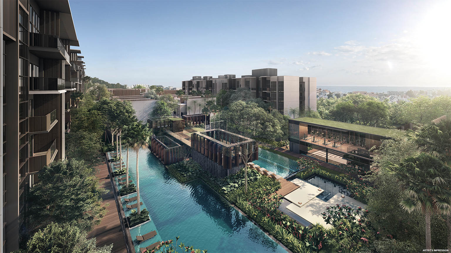
| Project: | Kent Ridge Hill Residences |
|---|---|
| District: | 05 |
| Address: | South Buona Vista Road |
| Tenure: | 99 years |
| No. of Units: | 548 |
| Site Area: | 319,250 sqft |
| Developer: | Oxley Holdings Limited |
| TOP: | 2024 |

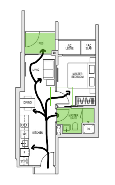
Last but not least, this Kent Ridge Hill unit was my personal favourite.
Unlike the other units, this unit technically only has ~21 sq ft of area that is purely dedicated to circulation.
However, public circulation in this unit is almost completely obstructed, and remains smooth even after all the spaces are activated and used.
While this could be attributed to how this unit is the largest out of the five (~484 sq ft), the most important reason lies in how circulation is weaved into the programme of the different spaces.
This meant that designers had actually made the effort to consider how the spaces would be like where liveability is in the picture.
Looking at actual spaces, this unit continues to impress.
While some may prefer for their shoebox units to be largely doorless to save space, I appreciated the proper segregation between the bedroom and the rest of the home.
Given the rather open floor plan in the more public parts of the house (i.e. the kitchen, dining area and living room), it is possible for me to have guests over without them ever crossing the threshold of my personal space.
That aside, there is also ample space for me to host guests over, which opens up the potential of this home.
The washroom is also well-situated within the unit. Given its central location, it can be easily accessed by anyone coming from any of the spaces. In terms of storage, it comes equipped with an above average sized store that is enough to accommodate a big storage size.
As someone who enjoys the outdoors, the Private Enclosed Space in this unit is the cherry on top. With an area of ~37 sq ft, this space allows for some light outdoor activities and some natural lighting.
I hope this has gone some way into helping other first time home buyers looking at shoebox units, from a liveability perspective.
Many people focus on external attributes like the location and price, and rightly so. But the problem is they tend to forget about what comes after – actually living in the unit itself.
But the fact remains – the process of choosing and purchasing a home is super subjective. Just because a certain condominium is popular does not mean that it is right for you.
While the prospect of owning a home may be exciting, it’s worth it to take the time to consider whether this home can accommodate your lifestyle, and future plans.
This article was first published in Stackedhomes.